
Overview
Client: Everyman
Role: Art Direction, Visual Identity
Year: March 2023 - Ongoing
Scope: Campaign identity, print, digital, motion
Role: Art Direction, Visual Identity
Year: March 2023 - Ongoing
Scope: Campaign identity, print, digital, motion
Outcome
A flexible, recognisable visual system used month-on-month to champion curated cinema across Everyman venues and channels.
The Brief
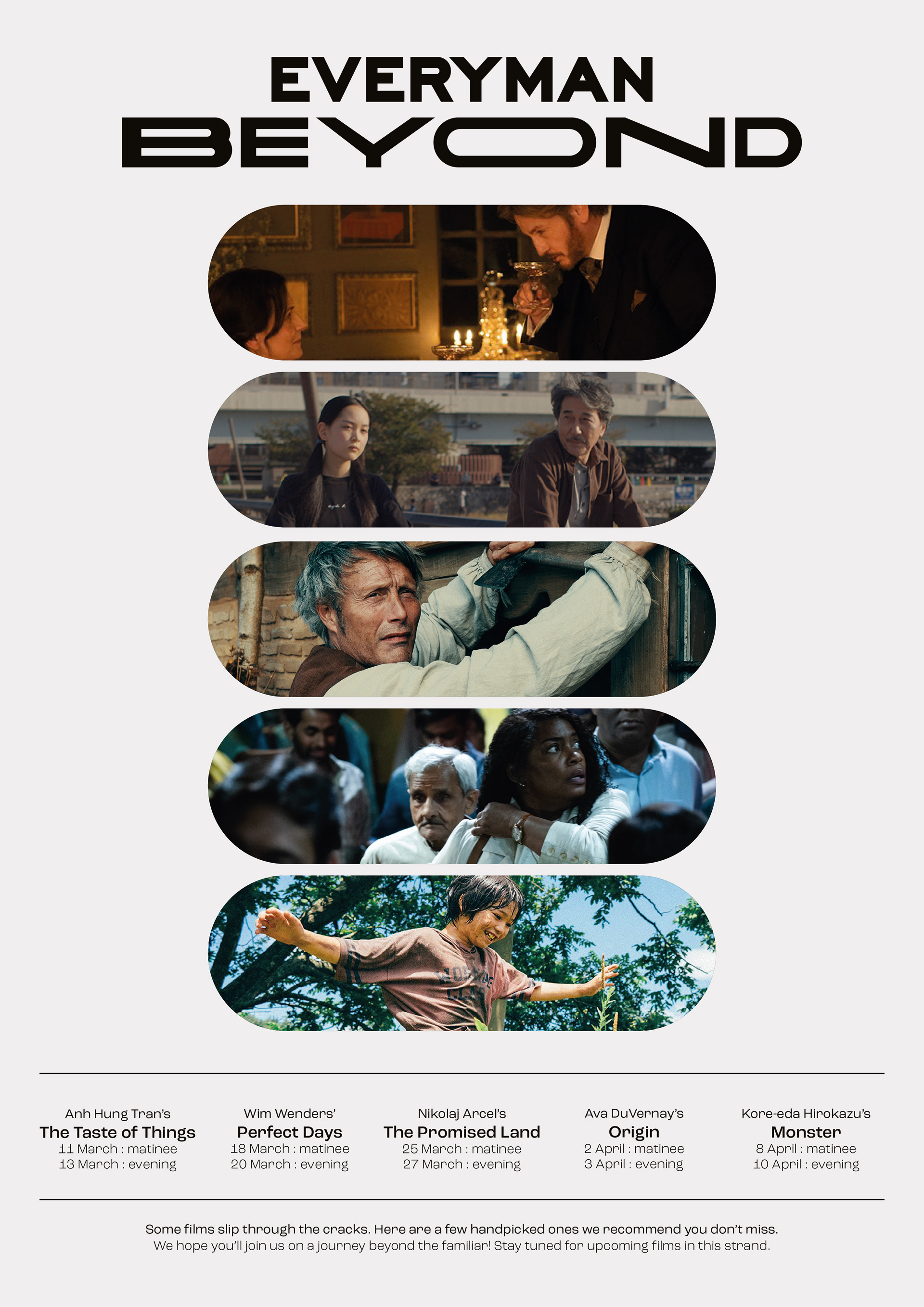
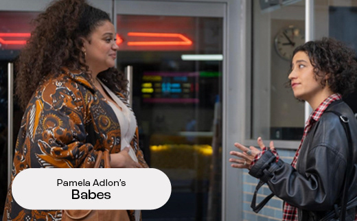
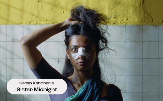
Beyond is Everyman’s monthly curated film strand, created to spotlight bold, diverse, and culturally rich cinema that might not always reach mainstream audiences. The campaign needed to signal discovery and intention - inviting audiences to explore films they may not yet know, but should.
The Idea
The identity centred on typography as a storytelling device. A clean, modern system anchored the campaign, with the extended “O” in Beyond becoming the core graphic element - symbolising expansion, curiosity, and pushing past the familiar.
The device was designed to be both practical and expressive: a container for titles, quotes, names, and stills, while acting as a visual marker for the series.

The Work
I developed a flexible visual identity applied across: Print and in-venue signage, digital and social assets, motion-led title sequences and end frames
The extended “O” flexes across formats, housing content while maintaining consistency.
While the monthly trailer was produced by a freelancer, I led the overall design direction and created the adaptable end-frame system, updating featured titles each month and ensuring cohesion across the campaign.


The Impact
The Beyond identity has been running consistently for over two years, forming a recognisable platform for curated thread across Everyman. It has been seen by millions of guests, playing in the trailer reel ahead of every film screening nationwide.
With Everyman welcoming millions of admissions each year, the campaign benefits from significant in-venue exposure, alongside monthly email communications to tens of thousands of subscribers and regularly updated paid and organic social content reaching over 120k followers. Together, the system has supported Beyond as a long-standing, high-visibility strand within the Everyman programme.