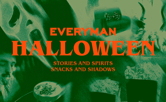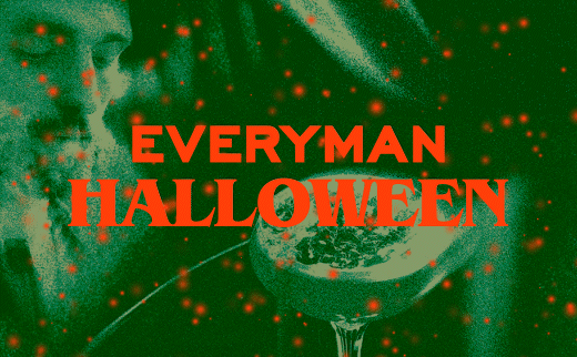
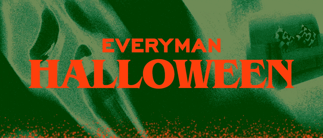
From this concept, I developed a visual language built around grainy film stills layered with sweeping, blurred motion. A dark grassy green and misty blue palette created an autumnal, cinematic mood, sharply contrasted with fluorescent orange typography for a jarring yet satisfying tension. The typeface ITC Benguiat - famously used in the Stranger Things title sequence - was chosen to tap into the cultural momentum of the new season while complementing the rattling, rumbling audio across the video assets.

Motion content flickered between film listings treated with grain and blur, while sparks of orange animation wafted up to eminate bonfire embers, reinforcing the idea of temptation and draw. Across social, digital, and in-venue screens, every element - colour, type, motion, and sound - worked in unison to create an emotionally charged campaign that drew the audience to spend Halloween at Everyman.