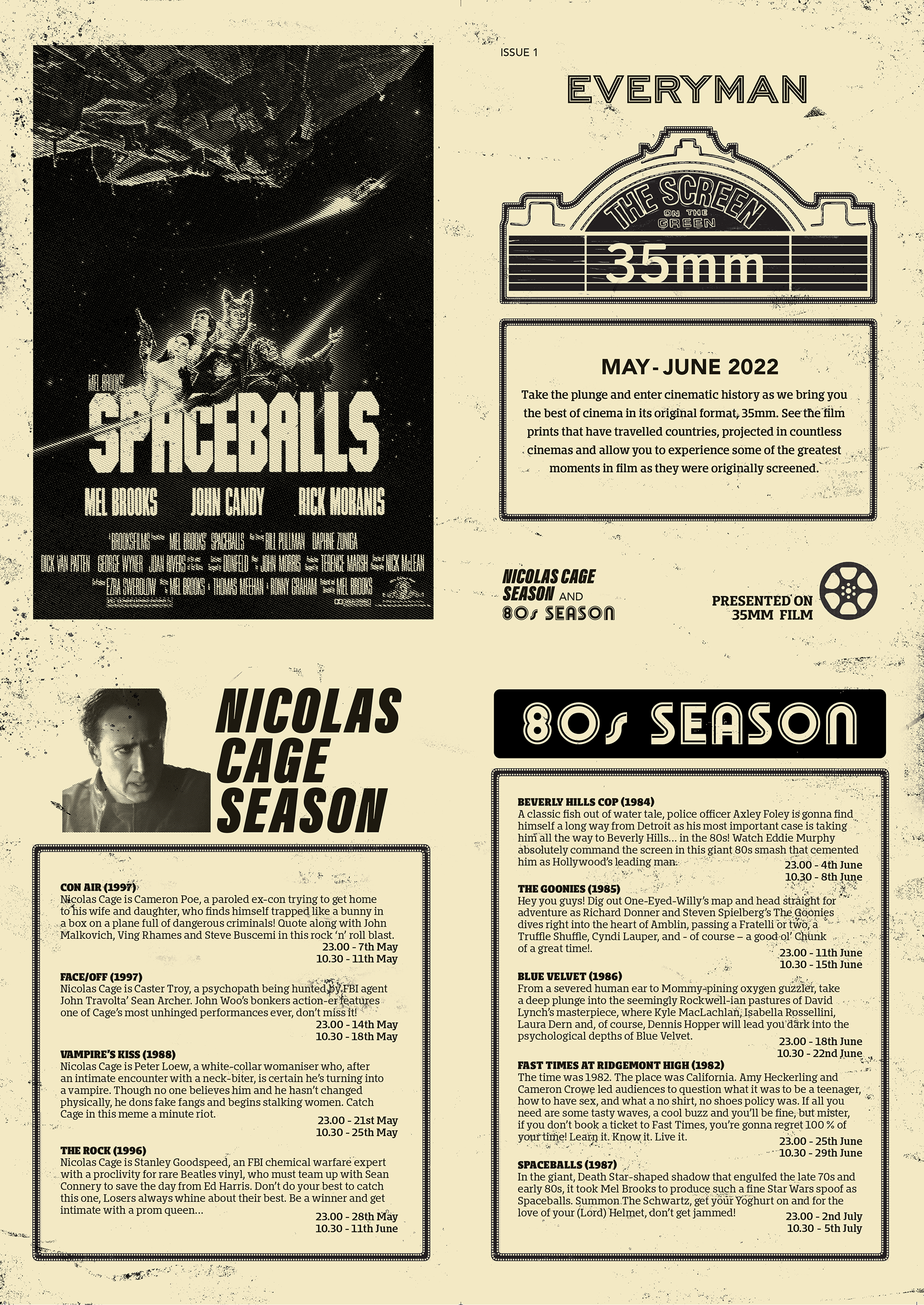
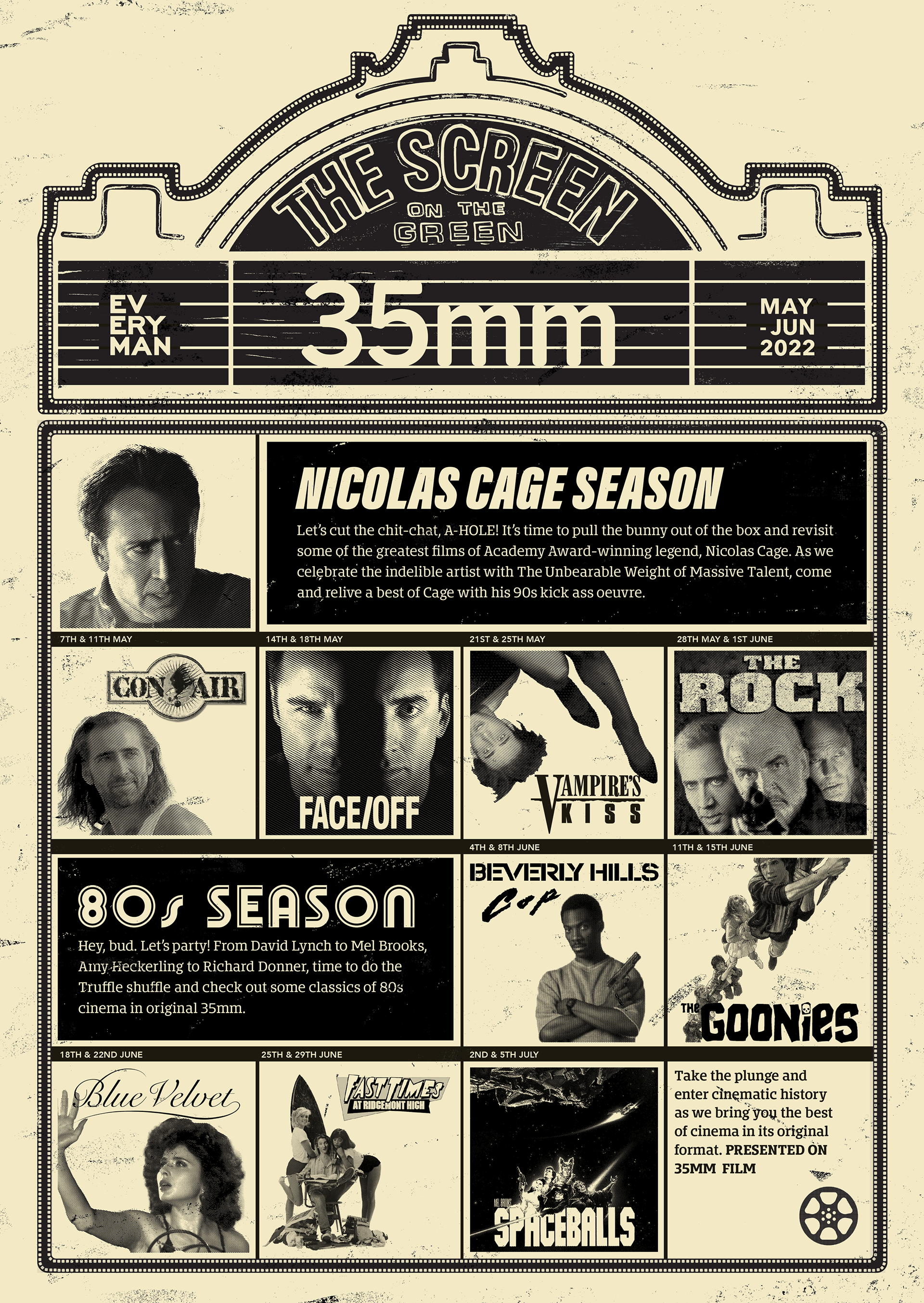
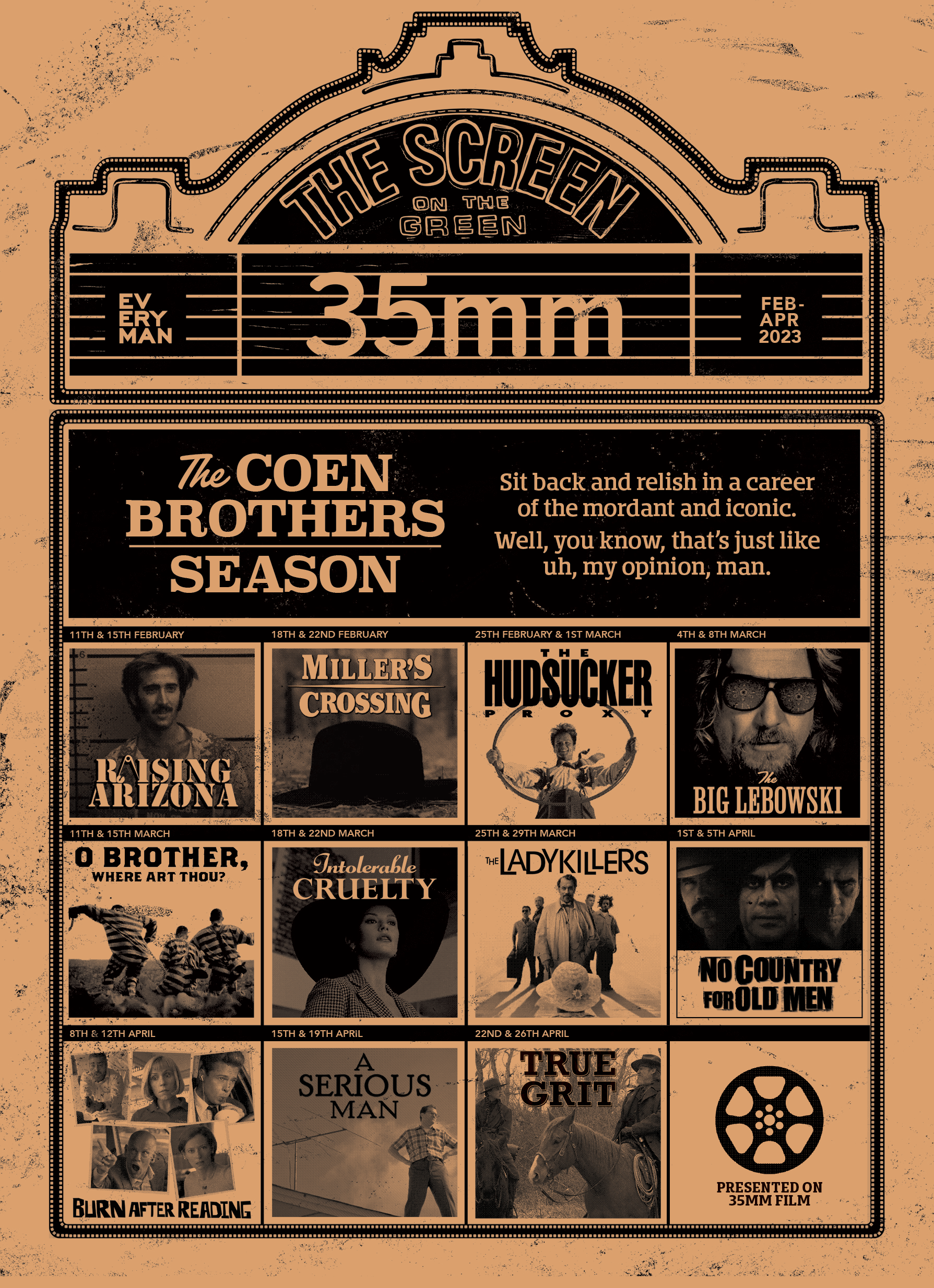
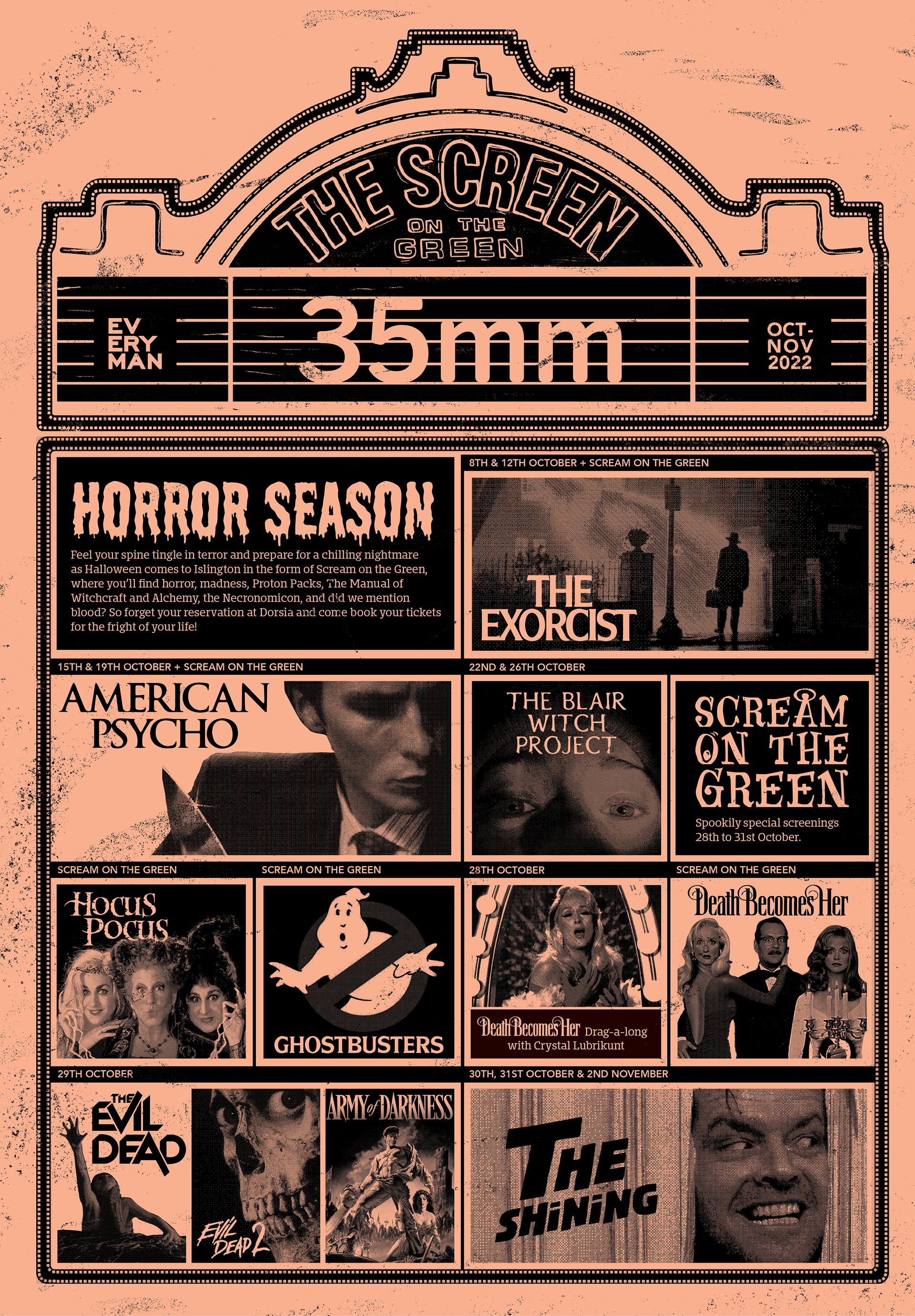
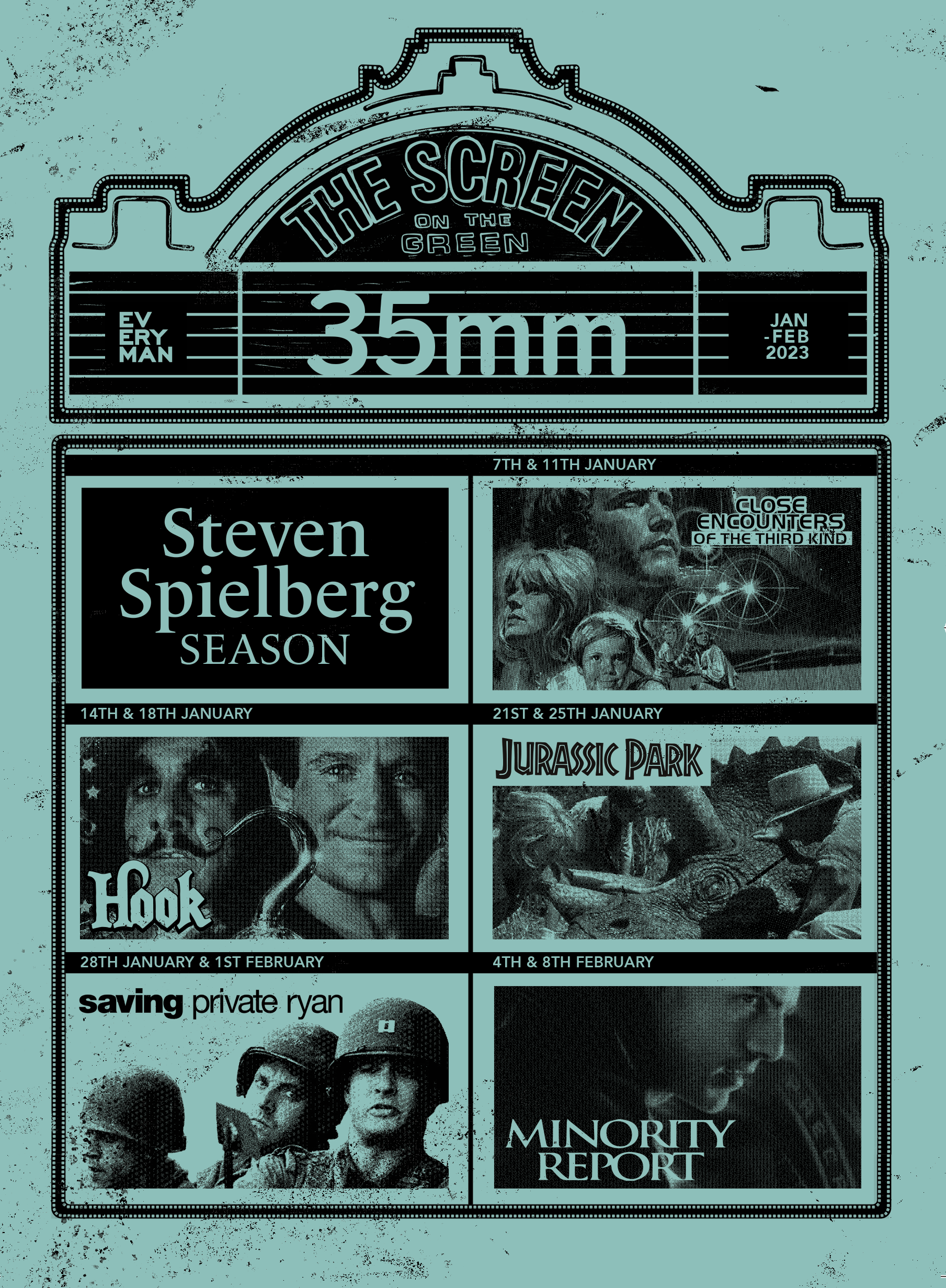
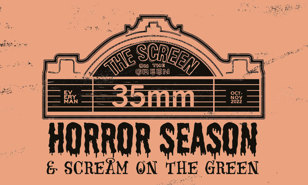
I drew directly from the tactile qualities of 35mm itself - the flicker, the grain, the signs of physical wear that give the medium its iconic texture. The design is grounded in this aesthetic. Each image in the promotional grid was bitmapped into grainy black lines, layered with subtle scratches and dust. The header features a hand-drawn version of Screen on the Green’s neon sign- a nod to the venue’s heritage - and if you look closely, the border is made entirely from strips of 35mm tape.
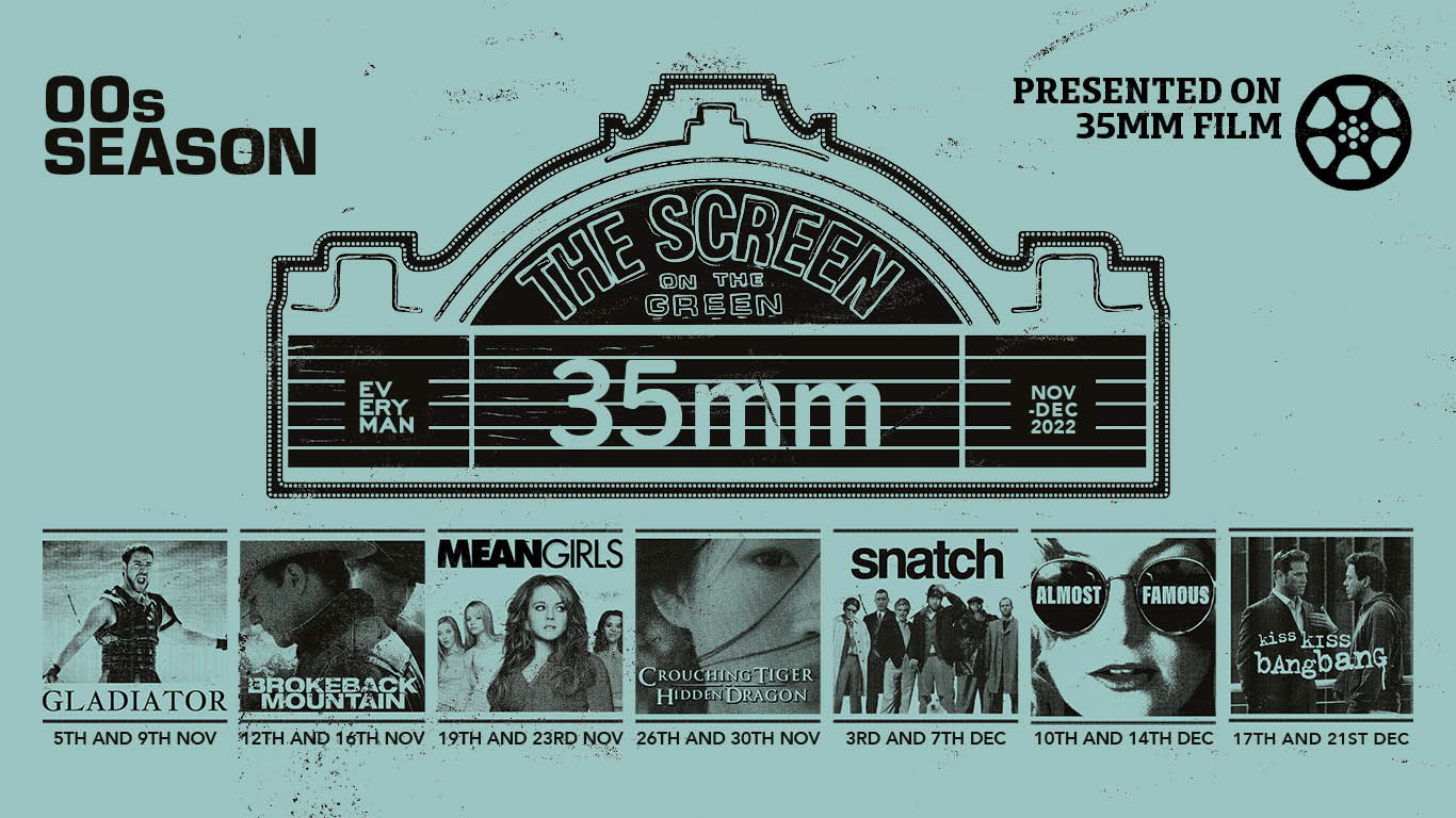
This approach wasn’t just stylistic - it was about storytelling. 35mm reels are passed from country to country, screening to screening, with their own narrative of wear and history. I wanted that story embedded in the identity. We developed a keepsake poster and a folded flyer for each new season - tactile, collectible pieces tailored to the cult audience that returns again and again. The creative was also rolled out across digital assets, including social media, website carousels, and targeted mailers.