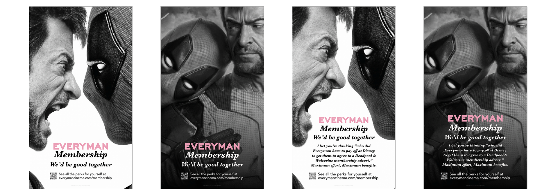
I also wrote the long-form copy for the campaign - intended as a tongue-in-cheek nod to Deadpool’s signature fourth-wall-breaking tone, blending sincerity with self-awareness.
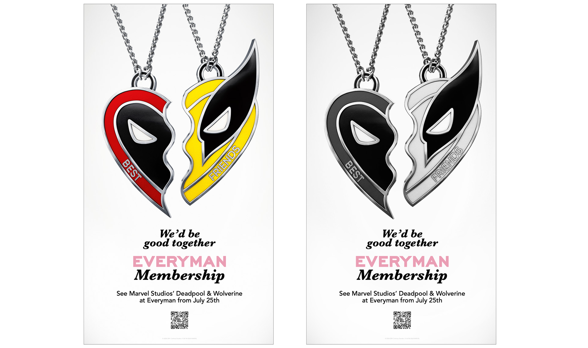
As the partnership with Disney evolved, there was a shared desire to visually tie the campaign more closely to the film. That led us to the now-central image: the necklace - a piece of merch that, at first glance, is playful and on-brand for Deadpool, but also speaks to the idea of bond, connection, and affection. For us, that mirrored what we were trying to say about membership: that it’s not just transactional - it’s a relationship with Everyman.
Because the campaign was digital-first, I pushed for the necklace to animate - but subtly. The goal was to create something elegant and minimal, that shimmered just enough to make you wonder, “Did that just move?”
This was a true 360° campaign, with assets rolled out across social, print, and large-scale out-of-home - blending cinematic nostalgia, modern design, and sharp copy to reframe membership in a way that felt playful, culturally relevant, and human.