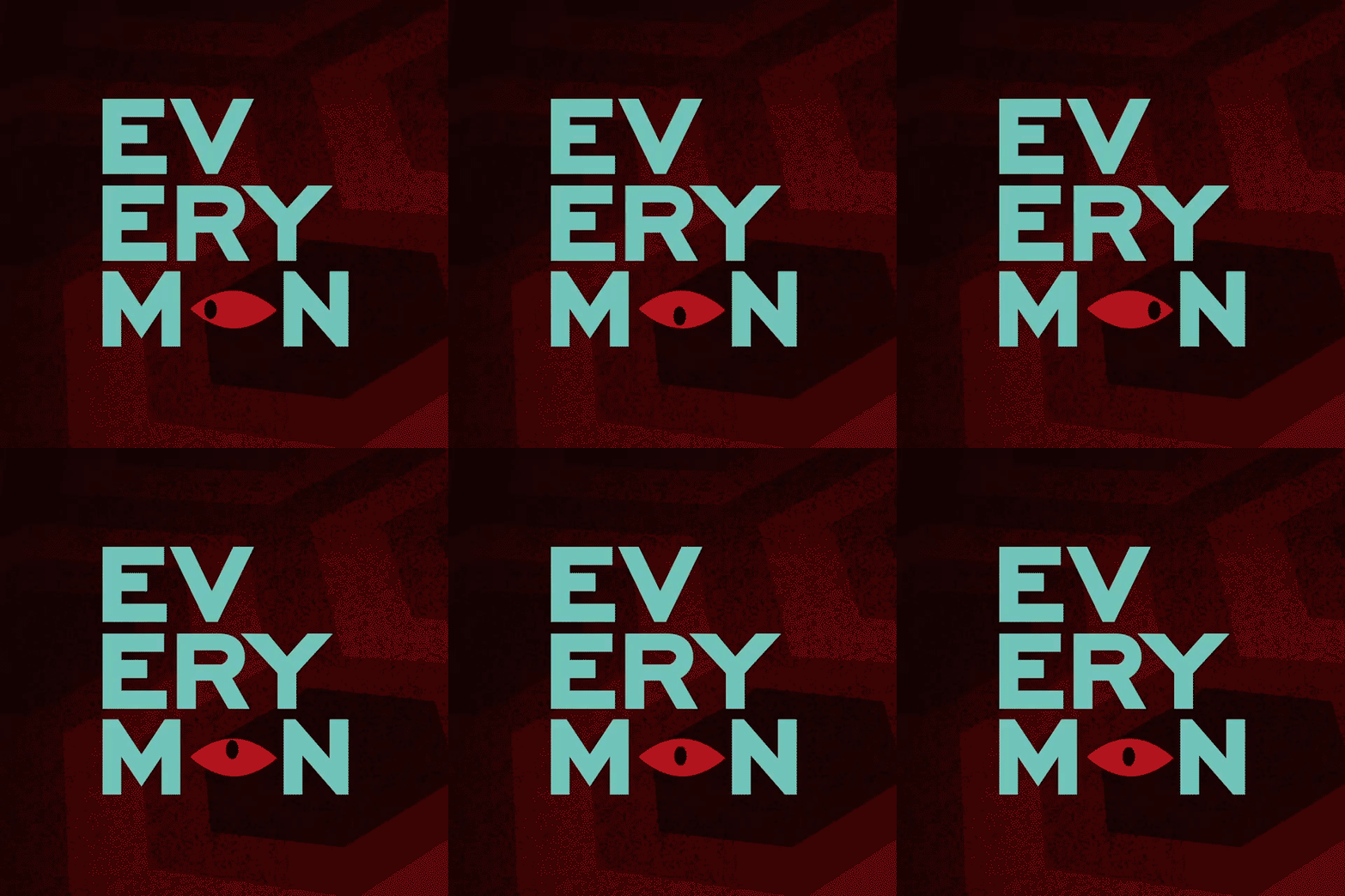
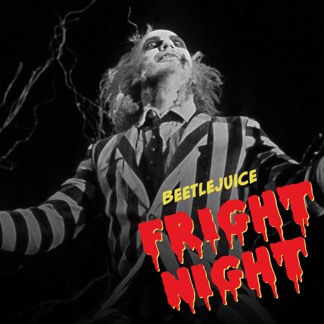
The design wove in horror iconography reinterpreted through the Everyman lens: the waiter’s outfit nodded to Beetlejuice, the typeface was borrowed from The Rocky Horror Show, and the backdrop drew on the infamous Shining carpet - a retro pattern we often echo in our interior design.
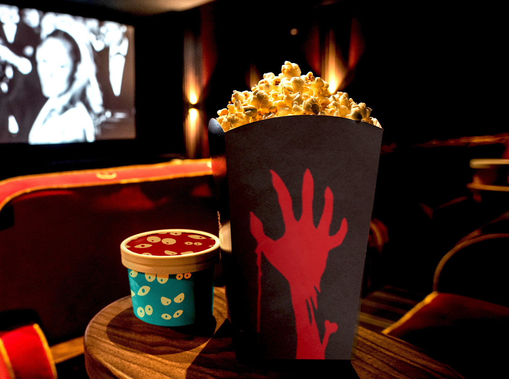
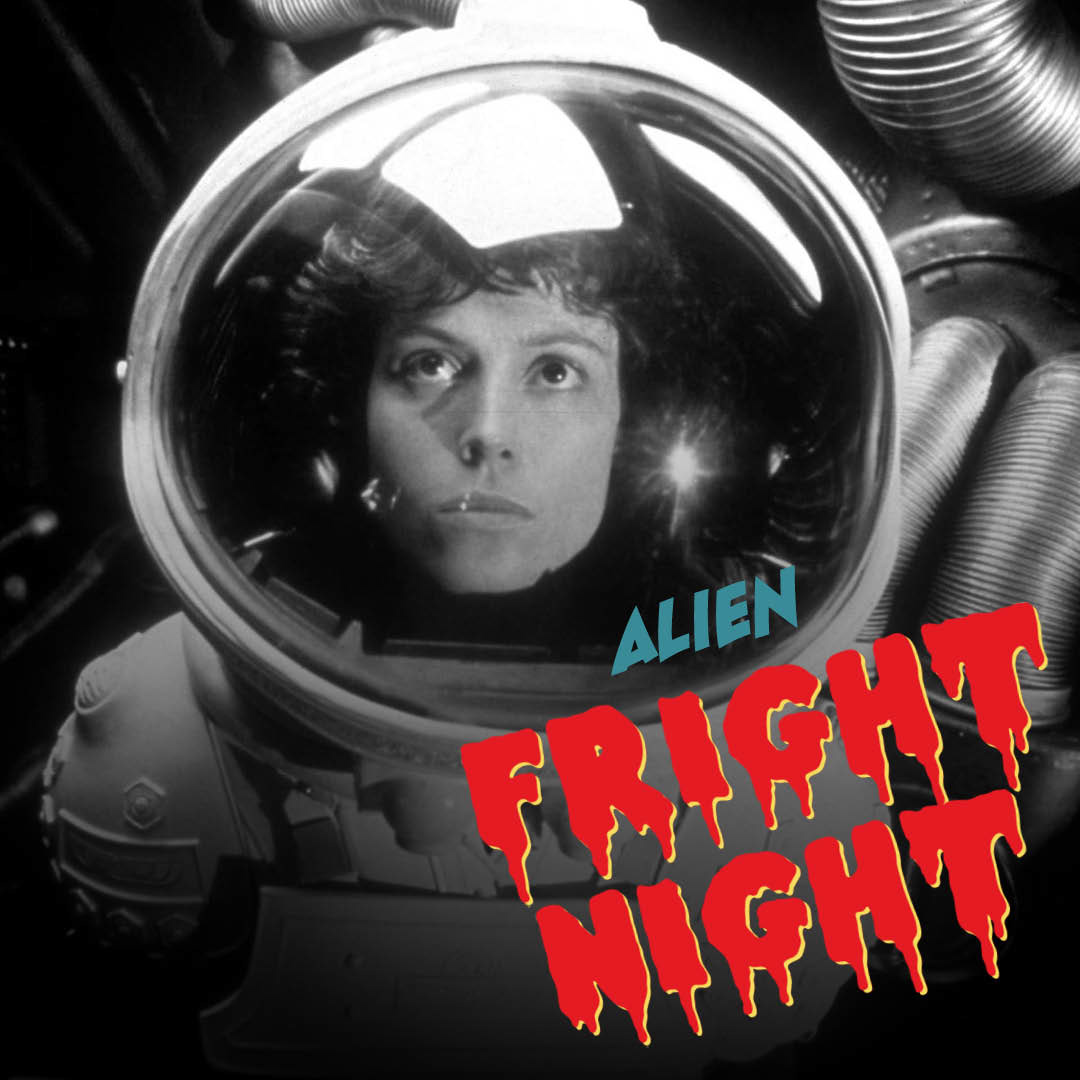
To extend the identity, I built out a suite of complementary assets, including snack pots, popcorn boxes, and carousel creatives to promote film titles across digital platforms - all consistent with the campaign’s mischievous, cinematic tone.
