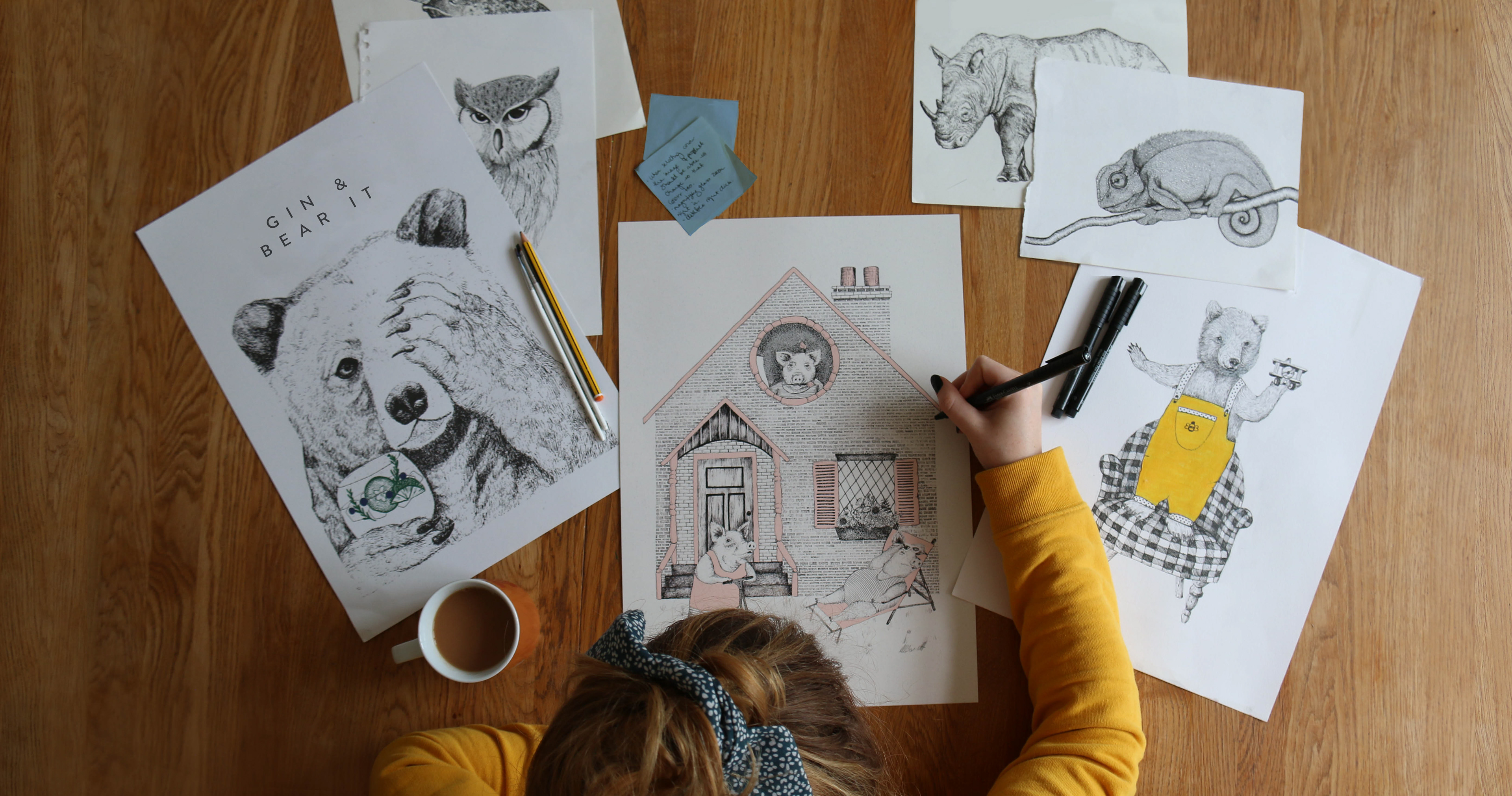
Hairytails is an independent art print shop I founded during lockdown - a passion project that quickly evolved into a fully self-run creative business. While it began as a simple outlet for illustration, it rapidly became a hands-on masterclass in end-to-end brand building. From coding and e-commerce logistics to marketing strategy, content production, and visual identity, I was responsible for every aspect of the shop’s creation and daily operation.
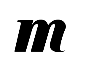
The white rabbit logo, inspired by Alice in Wonderland, captures the essence of what Hairytails represents: a deep dive into imagination. That feeling of creative immersion - the sense of getting completely lost in storytelling and character - is central to every piece I produce. Each print is rooted in narrative, drawing influence from music, film, and popular culture, and brought to life with a distinct illustrative voice.
Hairytails has been a challenging, rewarding, and deeply formative experience. It pushed me to evolve not just as an illustrator, but as a brand thinker and creative strategist - skills I continue to apply in every facet of my work today.
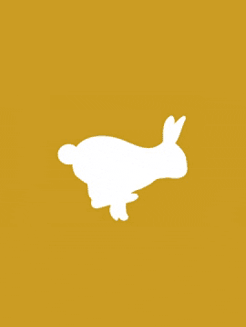
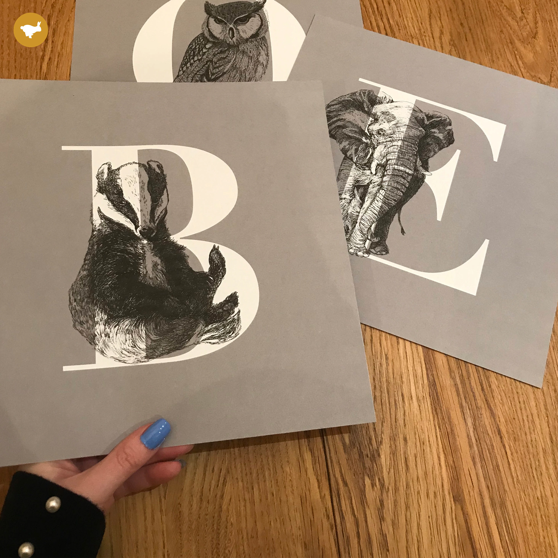
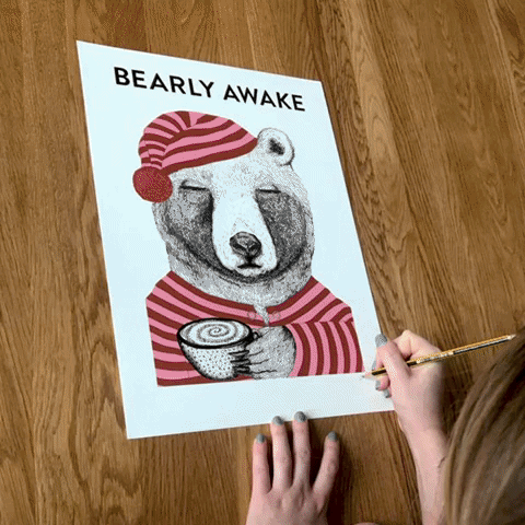
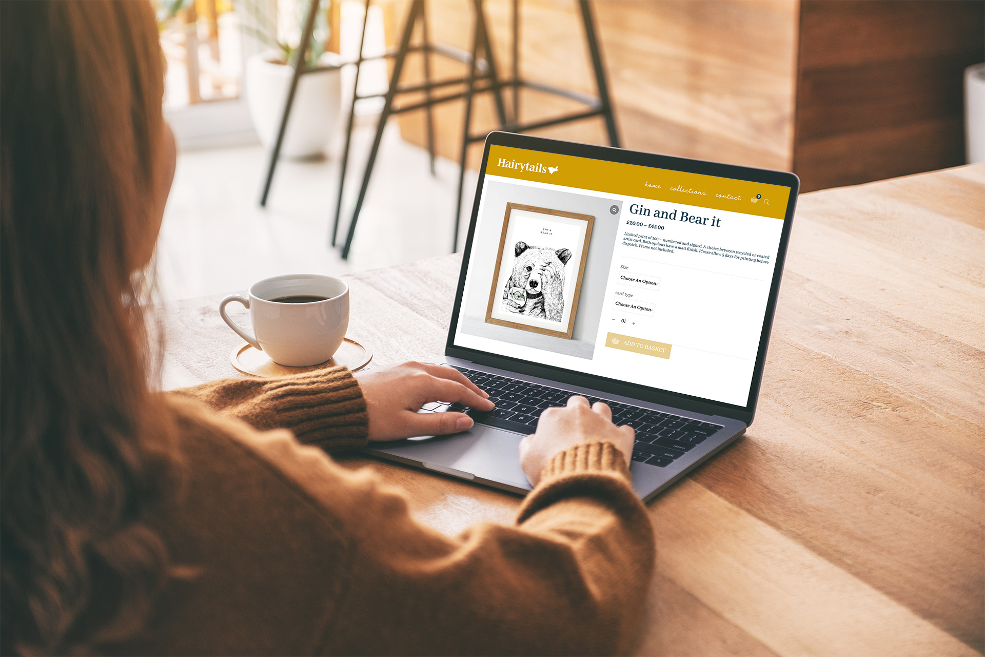
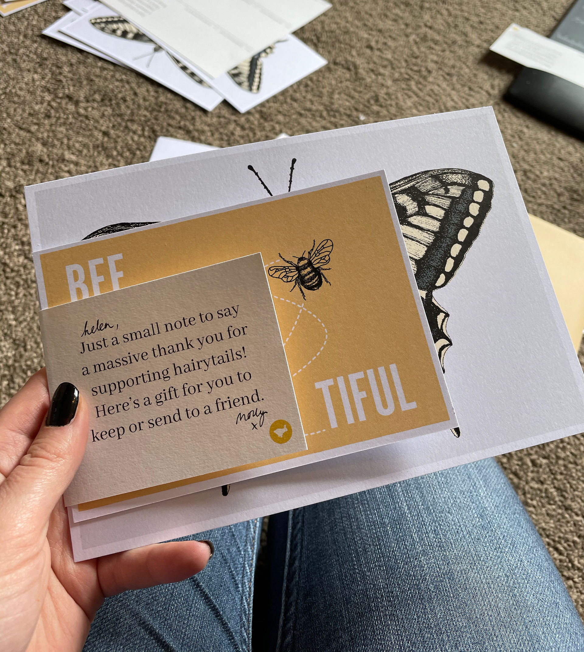
Hairytails became a vehicle for me to harness my most imaginative impulses and run with them - hence the running white rabbit at the heart of the brand. The identity draws subtly from the yellow, blue, and black palette of Alice in Wonderland, reimagined in a more mature, design-led tone to resonate with a grown-up audience. Visually, I kept the aesthetic pared back and grounded, using raw, minimal imagery to reflect the personal nature of the project. This is, after all, a one-person operation - run from my own kitchen table - and I wanted that authenticity to come through in every detail of the brand.