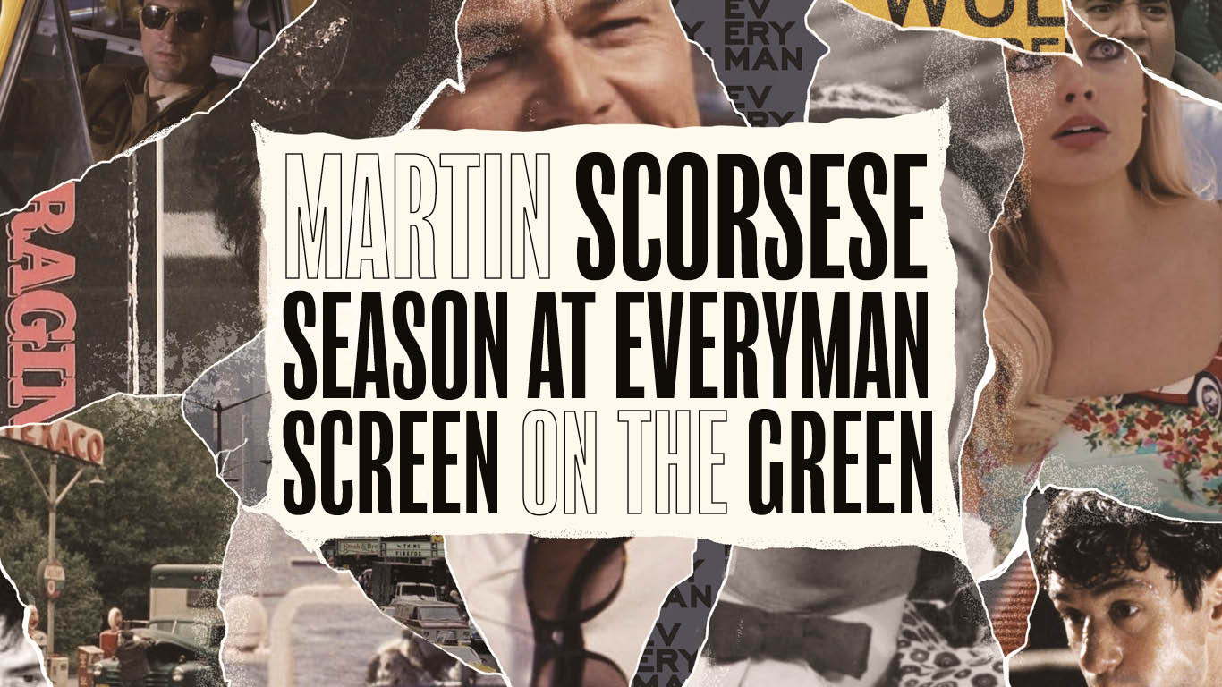
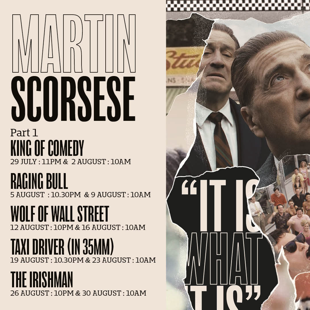
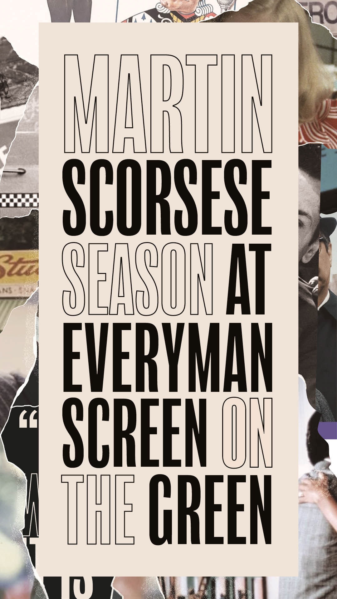
Drawing inspiration from the muted, consistent colour palette across Scorsese’s films and his deep-rooted ties to New York, I designed a collage-style artwork that referenced classic New York newspaper layouts - evoking the gritty, archival quality often embedded in his storytelling. The flyer became a key promotional asset for the season, visually uniting the films under one cohesive identity while also offering a subtle nod to the era and tone of Killers of the Flower Moon.


