Overview
Client: 3Beat Records / Police Car Collective
Role: Art Direction, Design
Year: 2021
Scope: Visual identity, logo design, single artwork
Role: Art Direction, Design
Year: 2021
Scope: Visual identity, logo design, single artwork
Outcome
A distinctive visual identity for an emerging alt-pop duo, establishing a recognisable aesthetic system that could flex across multiple releases while reflecting the band’s raw, lo-fi sound and DIY sensibility.
The Brief
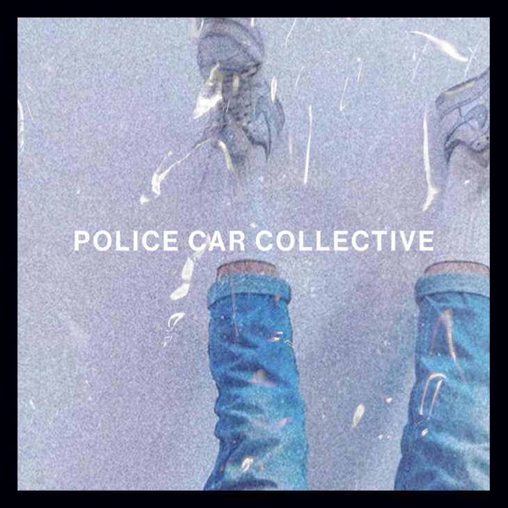
Ahead of the band’s debut single, 3Beat Records commissioned a visual identity that captured Police Car Collective’s energy - bold, vibrant, and nostalgic, with references to VHS culture, 90s punk, and lo-fi aesthetics.
The Idea
The identity balances restraint and disruption. A clean, sans-serif logo acts as a stable anchor, intentionally minimal to allow for more expressive, unconventional treatments elsewhere. This contrast mirrors the band’s music: familiar pop structures pushed through distortion, texture, and noise.


The Work
Developed a range of logo explorations informed by punk album art, cult film posters, and VHS packaging. Delivered a final typographic mark designed to scale and adapt across future campaigns. Created single artwork for Mine and I Think I Think Too Much. Introduced distorted and glitched typographic treatments - wavering, blurred, and imperfect - to visually echo the band’s warped, frenetic sound. Established a flexible visual framework for ongoing releases
The Impact
The identity gave Police Car Collective a cohesive and recognisable visual language from their first release, helping position the band confidently within the alt-pop space and providing a strong creative foundation for future singles and campaigns.
