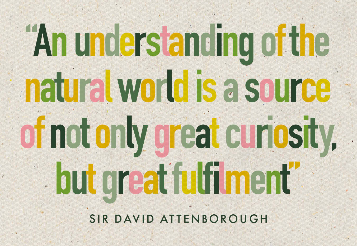
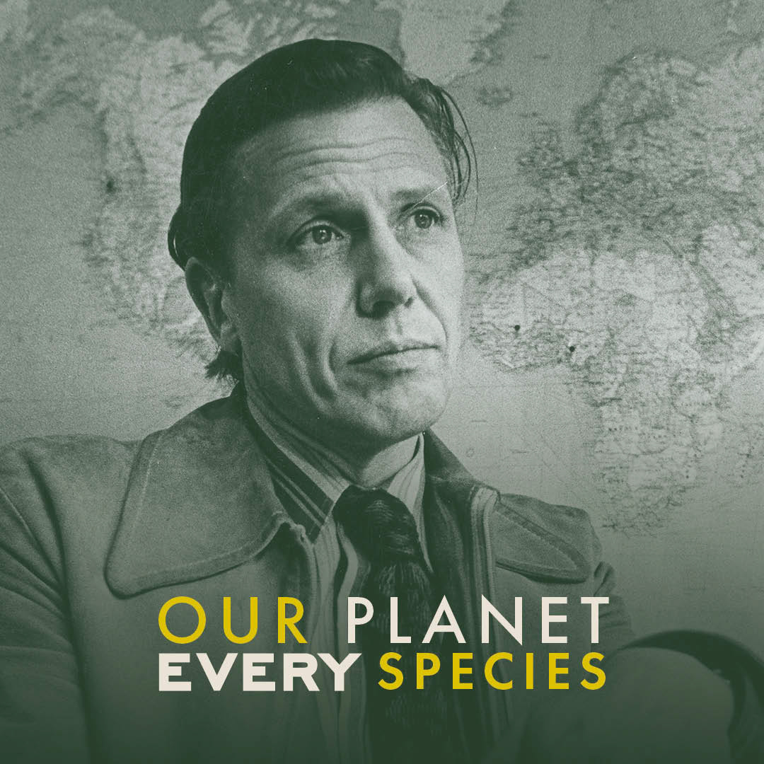
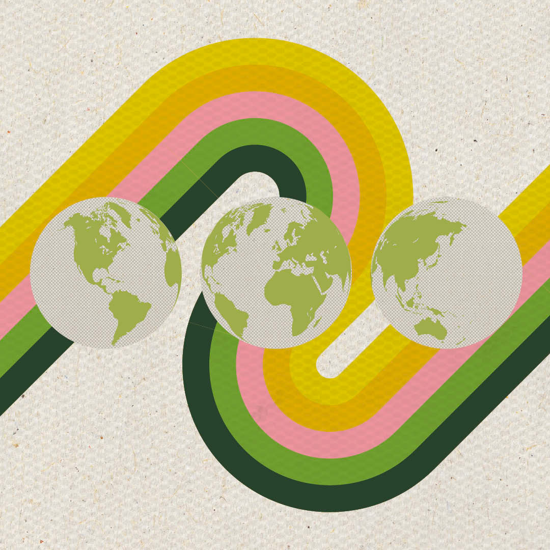
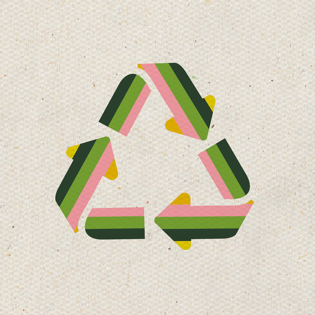
The visual identity was built around a palette of canvas greens, soft greys, and yellows - evoking the natural world - while a pastel pink thread ran throughout to retain a connection to Everyman’s core brand. Drawing inspiration from '70s design, I introduced retro colour bands and applied a fine gauze overlay to give the clean layout some gentle texture - an intentional nod to the kind of tactile fabric you'd expect to see in one of Attenborough’s iconic field gilets.

