
Overview
Client: Tom Everett ( Music Artist)
Role: Art Direction, Design
Year: 2020
Scope: Single artwork, visual identity development
Role: Art Direction, Design
Year: 2020
Scope: Single artwork, visual identity development
Outcome
A bold, emotionally driven single cover that evolved the visual language established on Tom’s debut release Patti. Reasonhas accumulated 923,307 listens on Spotify, with the remix reaching a further 279,280 listens, supporting an artist audience of 12.5k monthly listeners.
The Brief
Following the success of Patti, the second single needed artwork that felt recognisably part of the same world, while visually responding to the emotional tone of Reason - a dance-led track about rediscovering love and embracing vulnerability.
The Idea
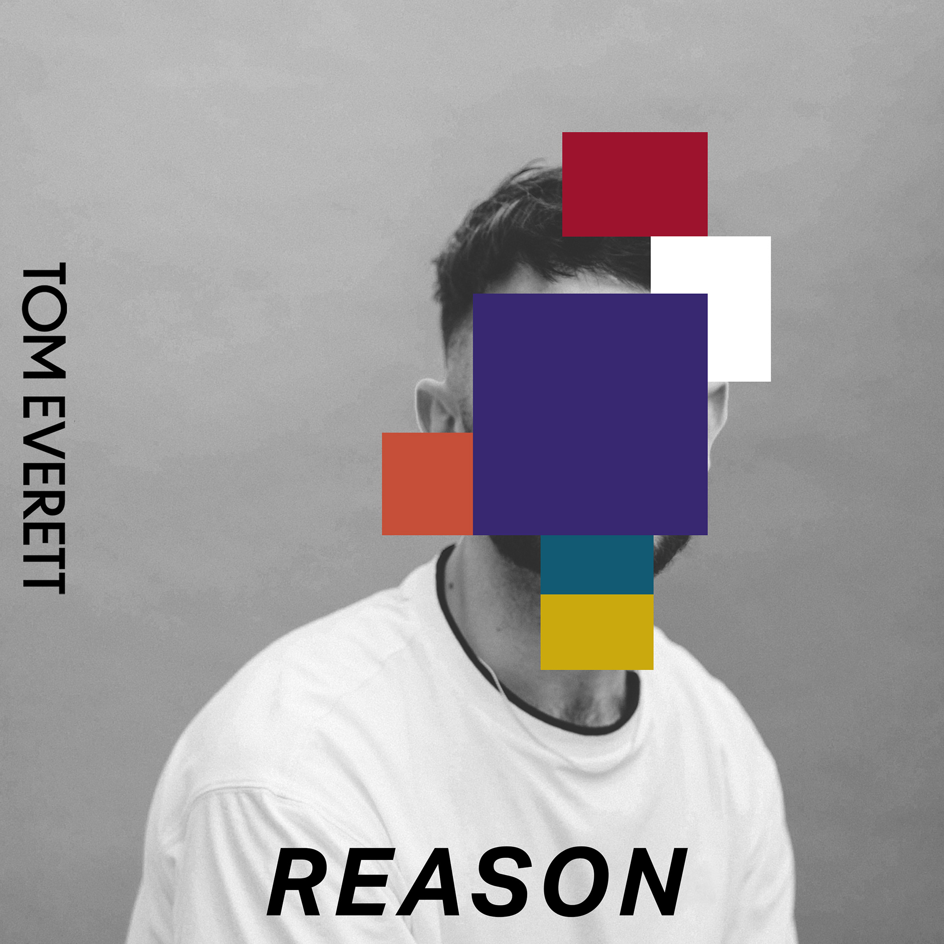
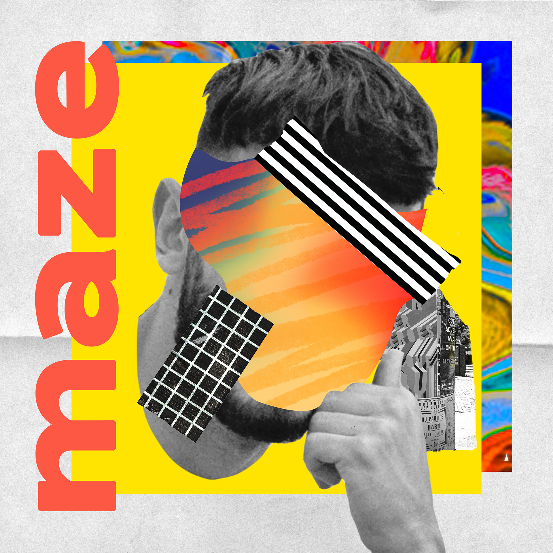
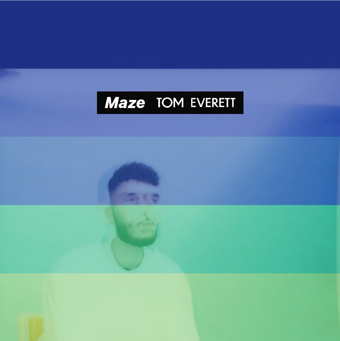
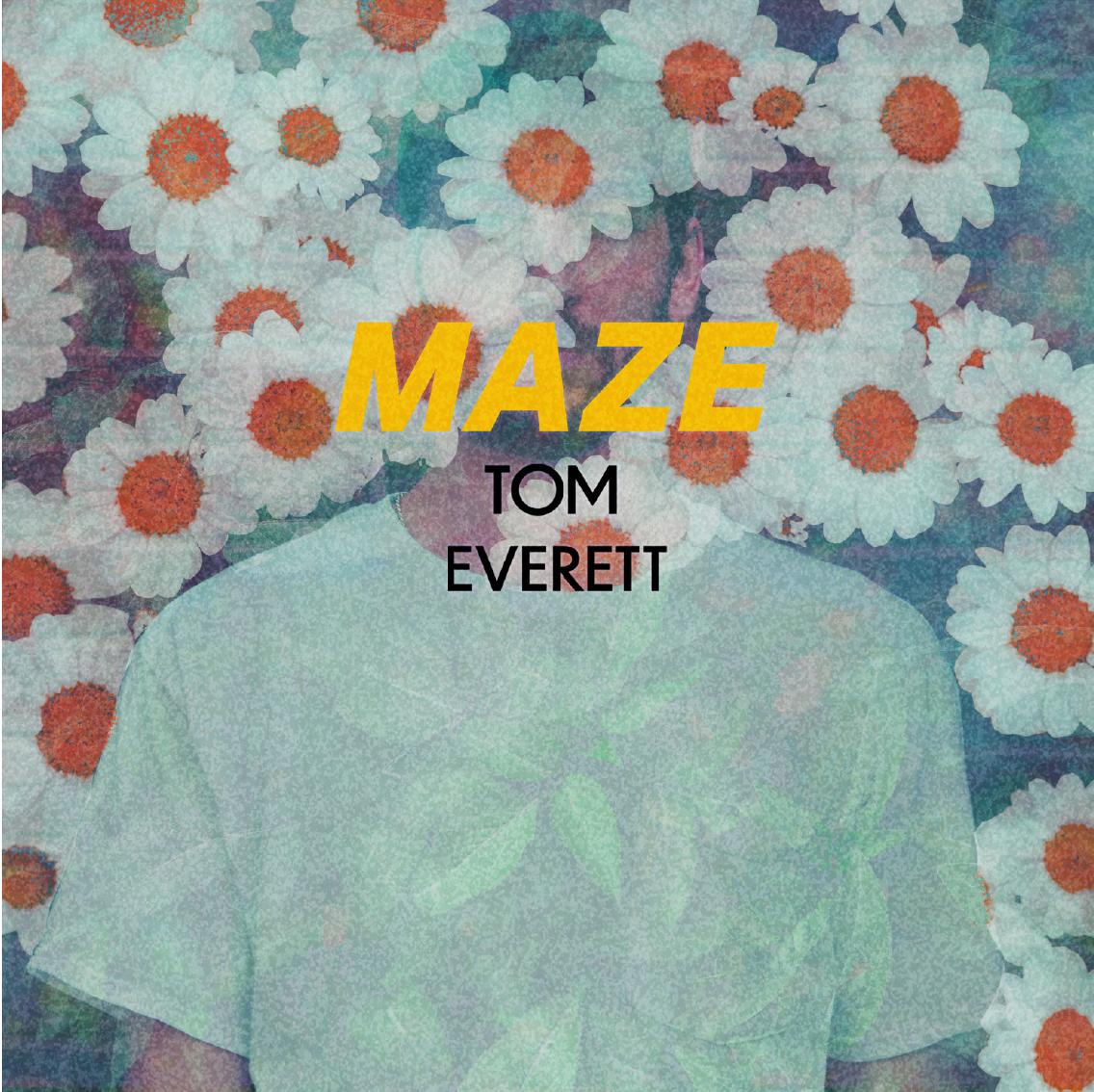
Originally titled Maze, the track explores emotional barriers, self-protection, and the process of letting someone back in. The visual concept centres on colour-block obstacles - graphic forms that act as both literal and metaphorical barriers. These blocks represent filtering emotions and “putting walls up,” echoing the themes in both the lyrics and production.
The concept also nods to Tom’s production style: manipulating and obscuring sound in post-production, creating a deliberate emotional distance between artist and audience.
The Work
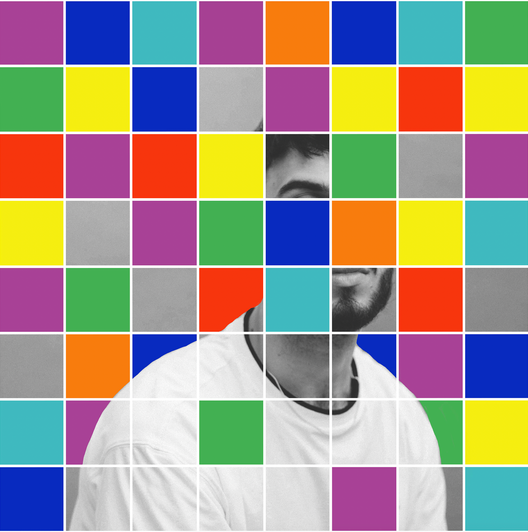
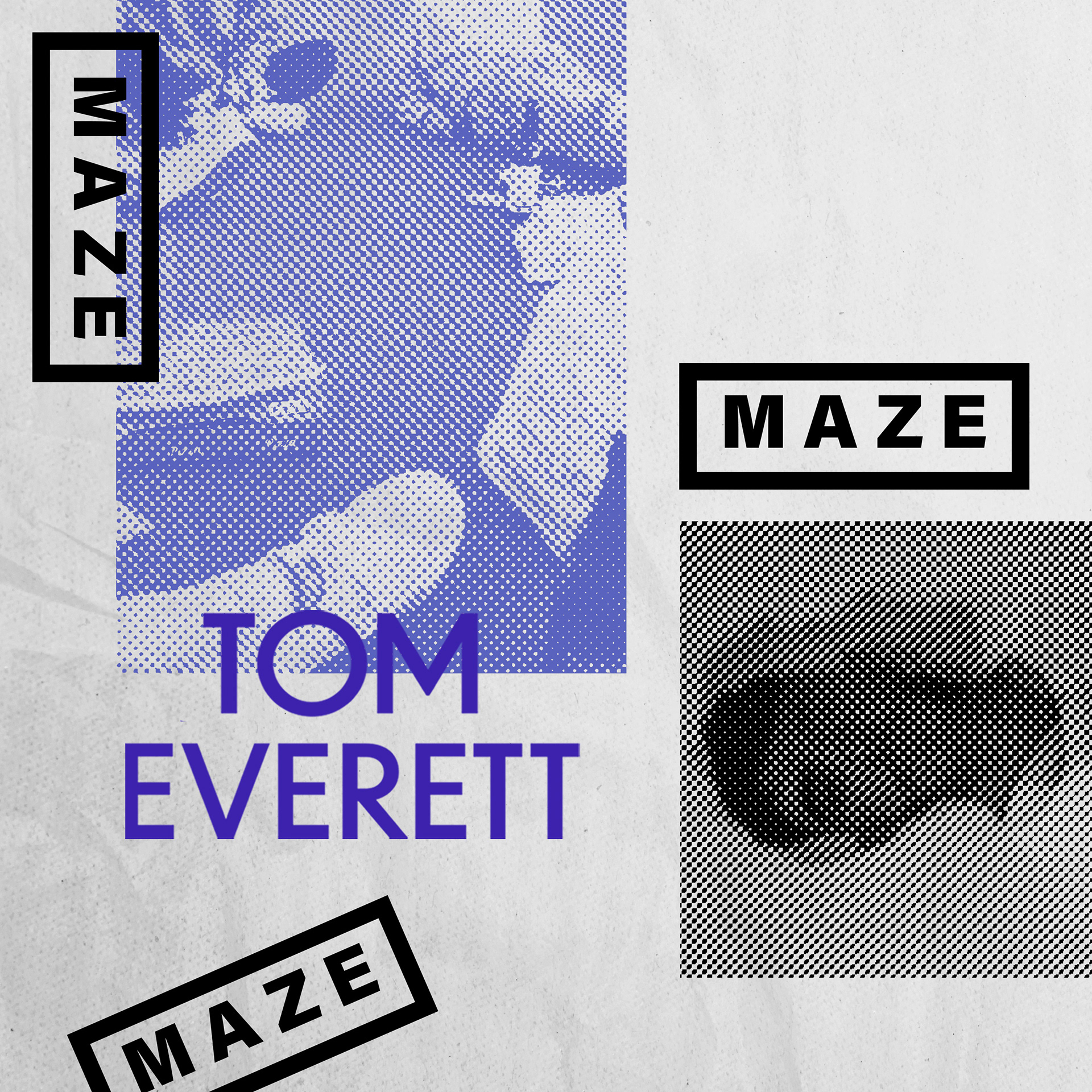
Designed a vibrant, colour-led cover rooted in contemporary graphic design. Carried through the same typeface from Patti to maintain visual continuity across releases. Developed layered compositions to create depth, tension, and intrigue. Explored multiple visual directions, presenting alternate versions to support creative decision-making. Adapted the artwork for remix releases, including a black-and-white variant
The Impact
Reason has accumulated 923,307 listens on Spotify, with the remix achieving a further 279,280 listens. The release contributed to the continued growth of Tom’s audience, who now averages 12.5k monthly listeners on Spotify.
The artwork helped solidify a recognisable visual identity across releases - strengthening brand consistency, emotional storytelling, and audience engagement as the artist’s catalogue expanded.